Inspiration
Finding Inspiration When Your Rooms Feel Flat
Creative energy at home ebbs and flows. Here are grounded, everyday ways to rediscover ideas for your space and look after yourself while you do it.
A confident monochrome scheme is one of the most sophisticated ideas in interior design, and far easier to achieve than most people assume.

There is a particular kind of calm that settles over a room decorated around a single colour. Instead of competing hues jostling for attention, the eye relaxes into a unified field, and the shapes, textures and light in the space become the real stars. This approach, often called a monochrome or tonal scheme, has a reputation for being difficult, yet it is arguably the most forgiving way to decorate once you understand the principle behind it.
The key insight is that monochrome does not mean a single flat shade repeated everywhere. That would be oppressive, like living inside a paint chip. A successful tonal room uses one colour explored across its full range of lightness and depth, from the palest tint to the deepest shade. A soft sage might appear as a whisper on the ceiling, a confident mid-tone on the walls and a near-forest depth on a built-in bookcase. The colour is constant; the intensity is not.
Choosing that anchor colour is a decision worth taking slowly. Consider how the room is used and when. North-facing rooms receive cool, steady light that can make blues and greys feel chilly, so a warmer undertone balances them. South-facing rooms flood with warm light and can carry cooler, crisper colours beautifully. Live with a few large painted samples on the wall for several days, observing them in morning, afternoon and evening light before you commit.
Once colour variety is reduced, texture becomes the element that keeps a room from feeling flat. This is where tonal schemes reveal their secret strength. A matt wall, a velvet cushion, a woven linen curtain, a glossy ceramic lamp and a nubby wool throw can all share the same colour family while reading as completely different surfaces. The light catches each one differently, and that interplay supplies all the visual interest the room needs.
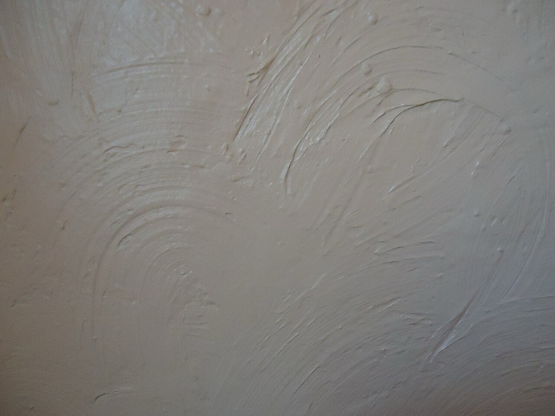
Finish choice on the walls themselves is part of this texture story. A deep flat matt absorbs light and makes a colour feel soft and enveloping, ideal for bedrooms and snugs where you want intimacy. A subtle eggshell or satin reflects a little more, giving walls a gentle glow and standing up better to wear in busier spaces. Using the same colour in two different finishes, perhaps matt on the walls and a soft sheen on the woodwork, creates quiet definition without introducing a second hue.
Contrast is still essential, but in a tonal scheme it comes from value rather than colour. Value simply means how light or dark something is. A room that drifts entirely through the middle tones can feel muddy and indecisive. Introducing a genuinely pale element and a genuinely deep one gives the scheme a backbone. The pale element lifts and opens the space, while the deep element grounds it and adds a sense of considered luxury.
Many people worry that a single-colour room will feel monotonous, but the opposite tends to be true in practice. Because the palette is so disciplined, every object you add becomes a deliberate note rather than noise. A single brass tray, a stack of pale timber, a dark stone bowl, all register clearly because they are not drowned out by colour competition. The restraint makes the room feel curated rather than cluttered.
Accent materials earn their place in these schemes. Natural wood tones, warm metals, stone and plant greenery all act as gentle counterpoints without breaking the colour discipline, because we read them as material rather than as paint colours. A tonal grey room with a single olive tree in the corner and a timber stool feels alive rather than clinical, precisely because those organic notes are allowed to breathe.
Lighting deserves careful thought in a monochrome space, because it is doing double duty. Layered lighting, meaning a mix of overhead, table and directional sources, sculpts the texture you have worked so hard to build. A wall colour that looks beautifully deep under a warm lamp in the evening may read quite differently under a cool overhead fitting, so test your lighting alongside your paint samples rather than treating them as separate decisions.
The woodwork question comes up constantly. Painting skirting boards, architraves and doors the same colour as the walls, a technique sometimes called colour drenching, makes a room feel larger and more serene because the eye is not interrupted by crisp white trim. It is a bold move that reads as highly contemporary, though some rooms with beautiful period detailing benefit from a subtle tonal shift that lets the mouldings cast soft shadows and show their craftsmanship.
If the idea still feels daunting, start small. A downstairs cloakroom, a study or a landing is the perfect laboratory for a tonal experiment, because it is a space you can commit to fully without the pressure of a main living area. Many people who try it in a small room find the result so restful that they go on to colour drench the rest of the house room by room.
A common mistake is to treat the ceiling as a separate problem and default to brilliant white overhead. In a tonal scheme this often breaks the spell, because a stark white lid draws the eye upward and interrupts the envelope of colour you have built. Carrying a pale tint of your chosen hue onto the ceiling keeps the room cohesive, and in deeper schemes painting the ceiling a soft mid-tone rather than white can make a tall room feel warmer and more intimate without seeming oppressive.
Ultimately, building a room around one colour is an exercise in trust. You are trusting a single hue to carry the whole scheme, and trusting texture, value and natural material to supply the richness. When it works, the effect is quietly spectacular, a room that feels composed rather than decorated, where nothing shouts and everything belongs.
Creative energy at home ebbs and flows. Here are grounded, everyday ways to rediscover ideas for your space and look after yourself while you do it.
Navy blue occupies a special place in the decorator's palette. It offers the depth and drama of black while keeping a softer, warmer soul. A navy room

Warm neutrals have a quiet way of gentling a room without ever stripping it of character. Shades such as oatmeal, putty, and warm stone carry a delica